Case Study
2019
Visa
Customer-centric redesign for one of the world’s most trusted payment networks. As the payment processing arm of Visa, CyberSource enables some of the largest global brands to accept and manage transactions at scale. Our team partnered closely with Visa leadership to shape a strategic redesign of CyberSource’s digital experience — aligning business positioning with user needs to drive customer loyalty and satisfaction.
With operations in 97% of countries worldwide, CyberSource processed over $241 billion in payments in fiscal year 2018 and handles more than 11,000 transactions per second. Collectively, Visa and CyberSource move over $480 billion annually — underscoring the critical importance of a seamless, trusted user experience in a high-stakes environment.
Industry
Financial Services
Role
Lead User Experience
Company
Publicis Sapient
Challenge
User Retention: – Analytics revealed that the majority of users drop off after visiting the homepage
Device Usage: – Predominantly desktop users, with most visitors using a 1920px screen resolution
Engagement: – The average time spent on the site was less than one minute
Enhance User Experience: – Improve navigation and way finding to facilitate easier site exploration. Optimize page-level messaging and content to increase relevance and engagement
Increase Conversion Rate: – Implement strategies to convert potential customers into actual customers
Brand Alignment: – Ensure all improvements align with the client’s short- and long-term brand vision
Process
01
Research
Conducted research on best practices, industry landscape, and then presented designs to our internal team and gathered feedback.
02
Design Audit
Analyzed existing brand guidelines—including colors, fonts, logos, and UI components—then modernized and enhanced current elements while developing new components as needed.
03
Information Architecture
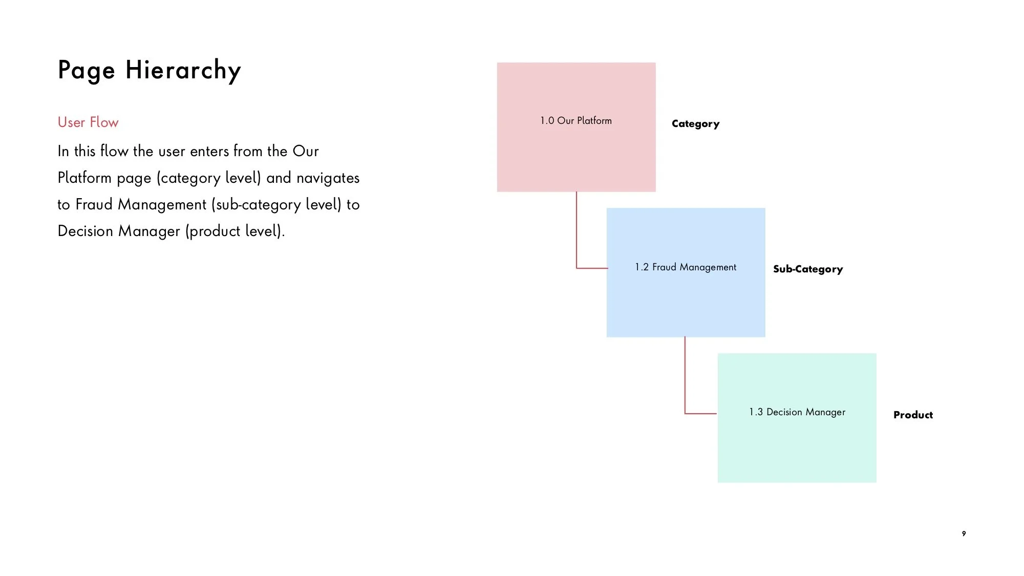
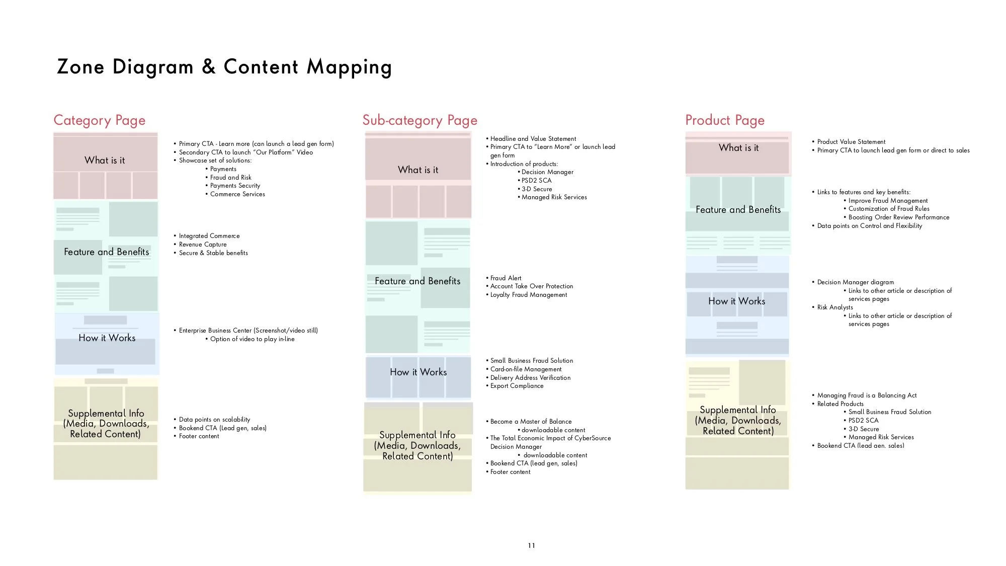
Created new site map and evaluated page level content and messaging. Designed out wireframes and templates for the most important areas of the website include global navigation, homepage, category page, sub-category page, and the search experience.
04
Prototype
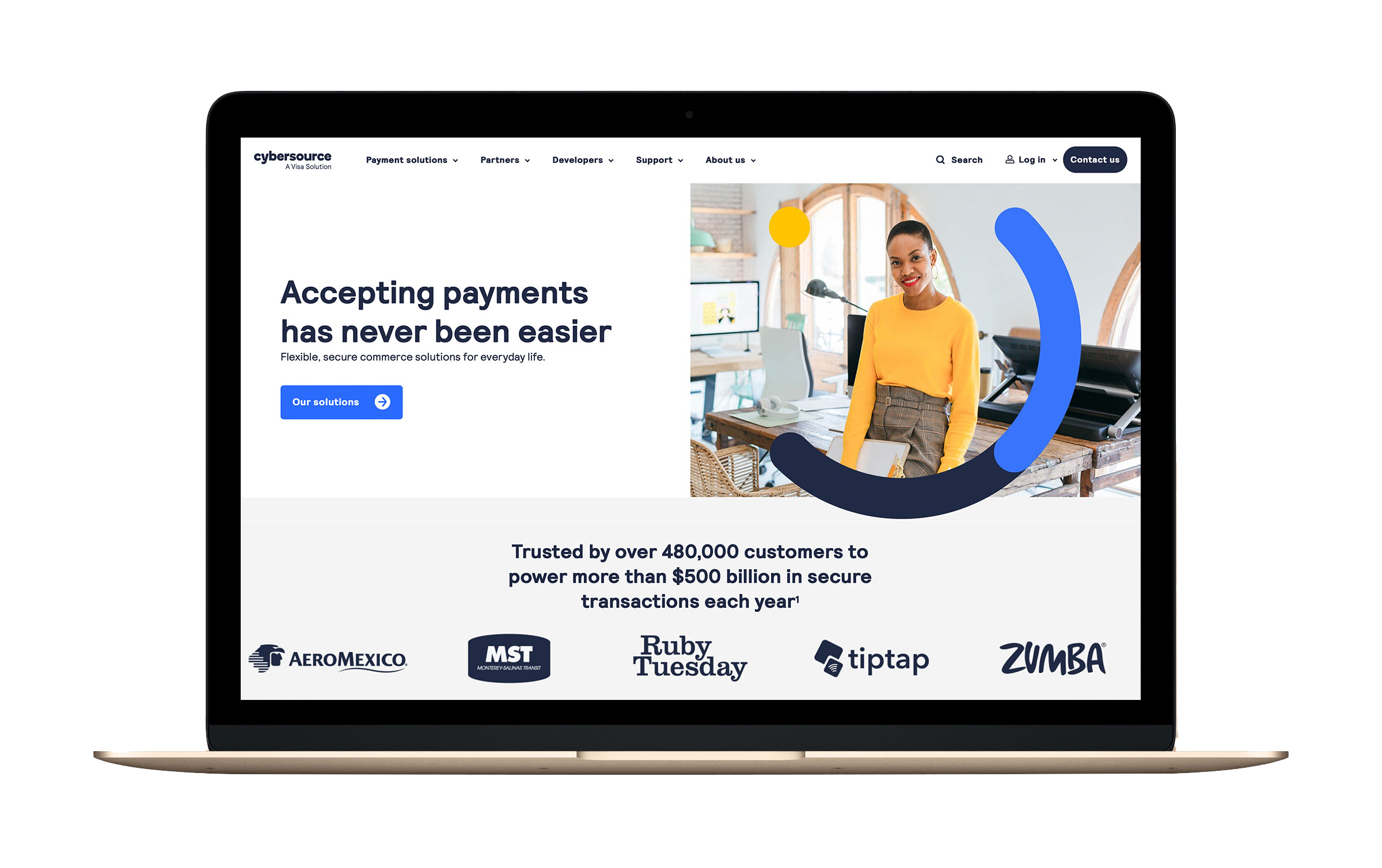
I designed responsive variations across mobile, tablet, and desktop, then collaborated with internal teams and clients to refine the concepts. The final prototypes were tested with Visa’s UX team to validate our global navigation approach.
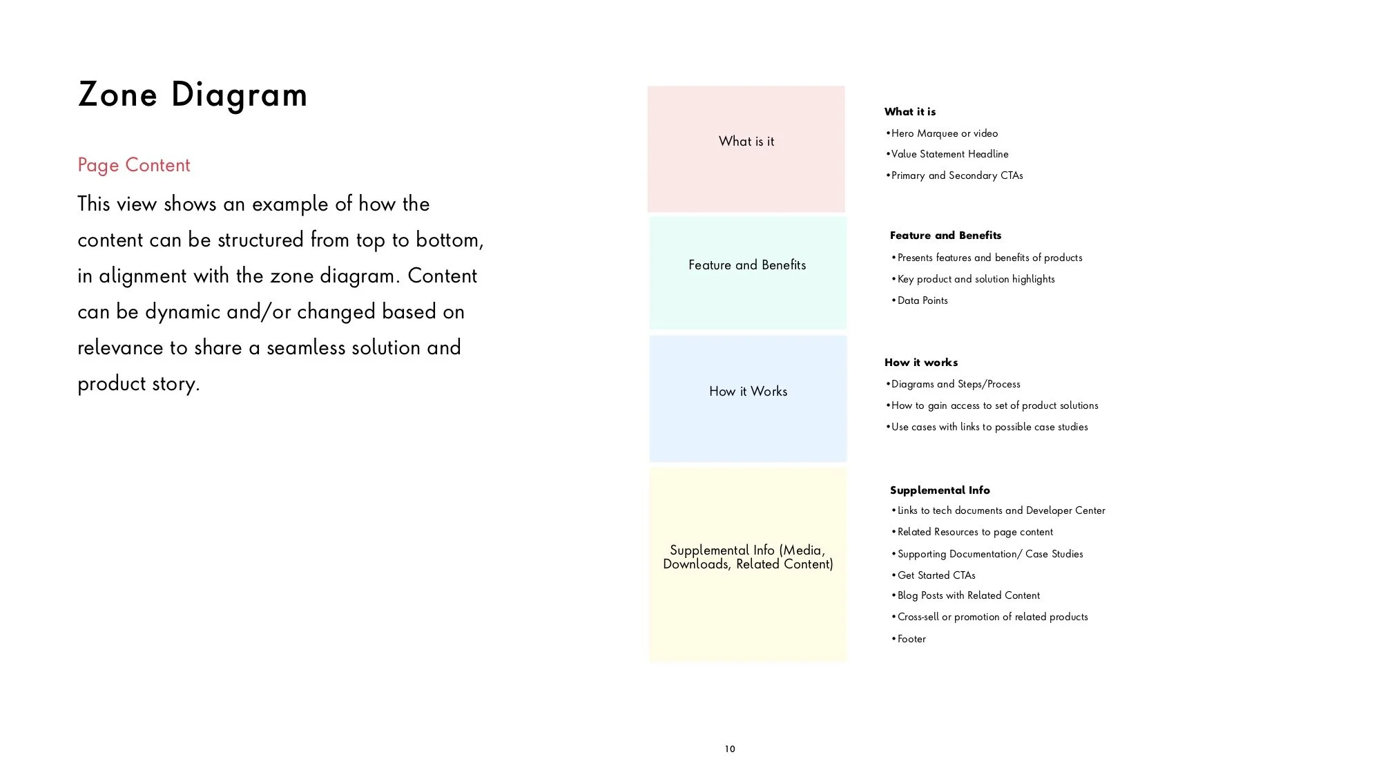
Zone Diagrams
Telling a solid story throughout the page allows the user to easily find the information they need in order to make important decisions for their business. The zones help neatly group and organize content across all pages of the site. This is very helpful within large complex sites for the user to know where to go to find the information needed.
Conclusion
Through strategic design and collaboration, we delivered a modernized platform that simplified navigation, clarified content organization, and elevated the brand’s digital presence.
Prototype
Simple flow
Category level page to a product page across both large desktop (1920px) and mobile (375px) viewports